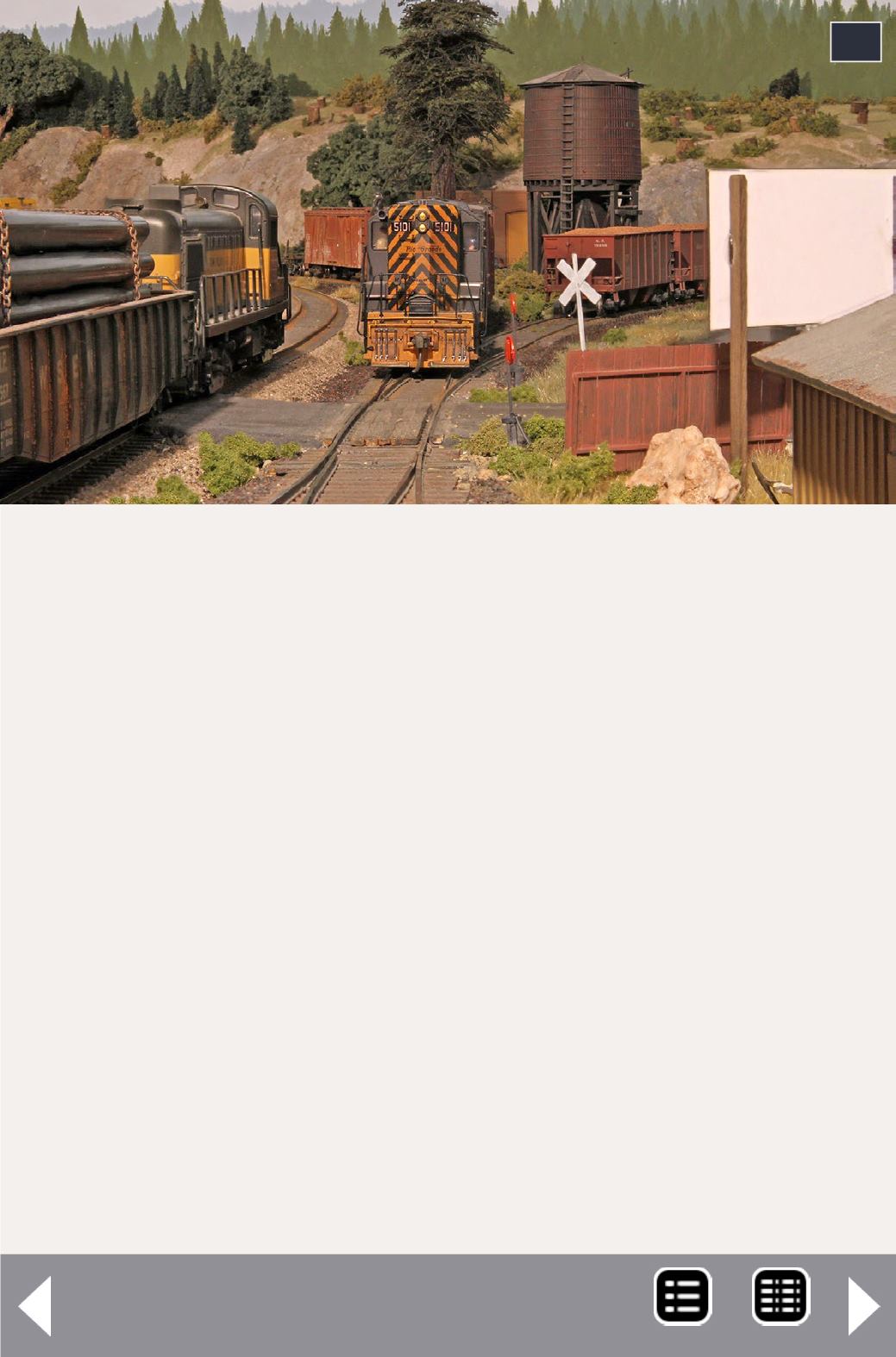
pipe load to the gondola to hide the edge of the layout beyond
it. However, this photo didn't do much for me. The pipe load
blocked the view beyond, the Alco's paint job looked a bit dull,
and the background felt sort of flat. It also was obvious that the
huge white expanse of the B. Josef sign would have to change.
I made a few changes and moved the camera back a bit to get
photo 13. Swapping a Baldwin Consolidation (2-8-0) for the
Alco diesel helped. Although empty log cars would seldom see
this end of Oakhill during an op session, I thought they helped
here as well.
Attacking the back of that white sign with India ink and alco-
hol resulted in an effect that looked like filthy plywood – a big
improvement and the view of the shack with its peeling roof
edge seemed to complement the newly dirty sign.
I thought this was looking promising but there were still some
other camera angles I wanted to explore.
12
12: The back of the B. Josef sign on the right was way
too white and desperately needed a layer of grime.
Up the Creek - 7
MRH-Aug 2013


