getting retina displays having pixel
resolutions similar to print, type
experts recommend a Roman-style
body font as easier to read, so that’s
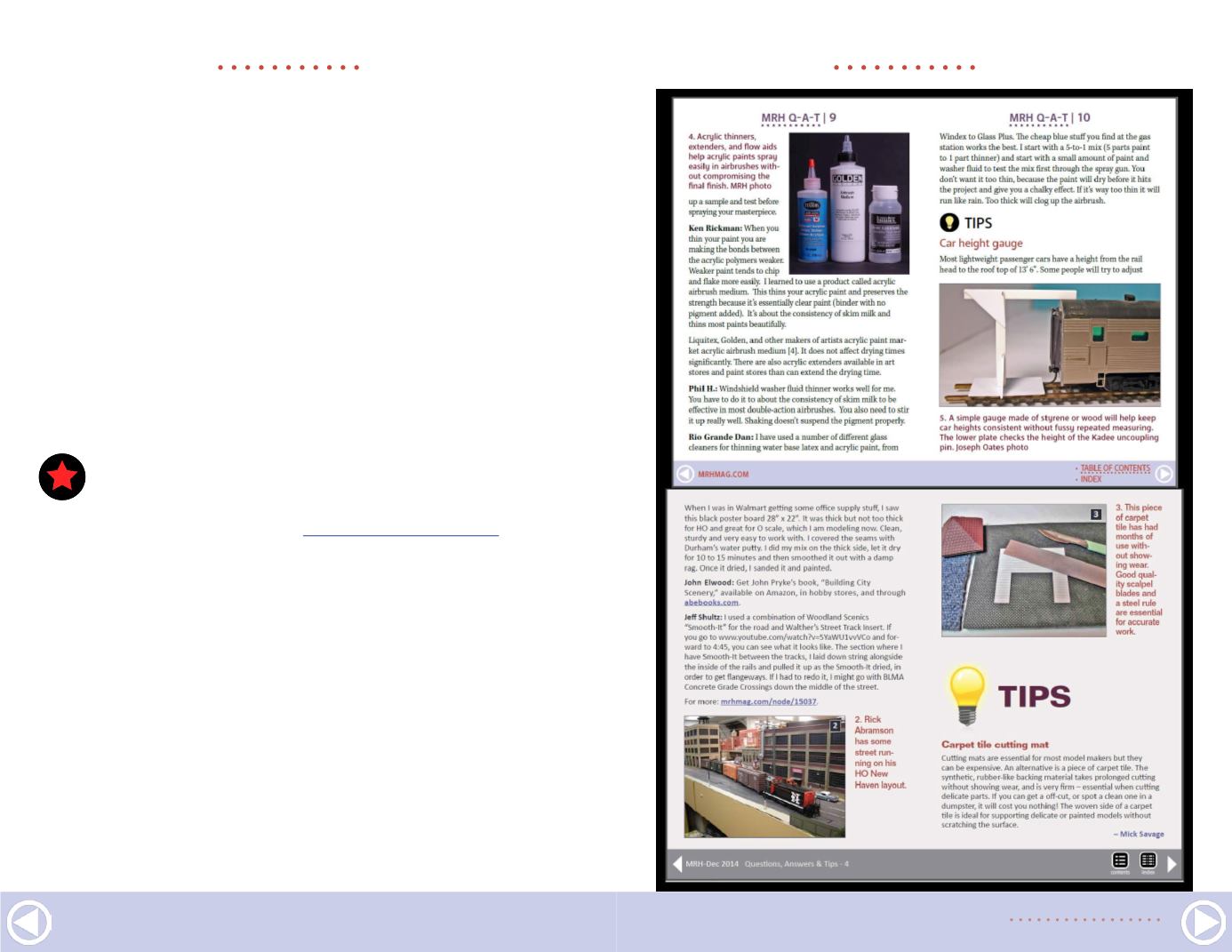
what we’ve done.
The biggest change, however, is our new MRH shield logo. We
felt it was time to move away from our stylized text logo to
a more compact and bold logo. We engaged Scott Thornton,
graphic designer and model railroader, to help us define much
of this new look. Thanks, Scott, for a job well done!
In case you’re wondering how the old and new look compare,
here’s a comparison [1]. The page width is a bit less because
STAFF NOTES |
2
STAFF NOTES |
3
1. (opposite) Here’s a
side-by-side comparison
of MRH’s new Gen3 look
(top) to our previous
Gen2 format (bottom).
. . . . . . . . . . . . . . . . . . . . . . . . . . . . . . . . . . . . . . . . . . . .
LAST ISSUE’S RATINGS
The top 5 rated articles in the
of
Model
Railroad Hobbyist
are:
.
4.7
DCC Impulses: A look at LokSound DCC
4.5
What’s Neat: Christmas potpourri
4.5
The moving of Aberfoyle Junction
4.5
Adding sound to an N scale diesel
4.4
Maintenance flags and signs
Issue overall:
4.4
Please rate the articles!
Click the reader comments button
on each article and select the star rating you think each article
deserves. Thanks!
. . . . . . . . . . . . . . . . . . . . . . . . . . . . . . . . . . . . . . . . . . . .


